Rocketleague UI Redesign Concept | Screen 2/5
I've been a fan of rocket league since i first saw the trailer in early 2015. It is the game that I have spent most time on, period.
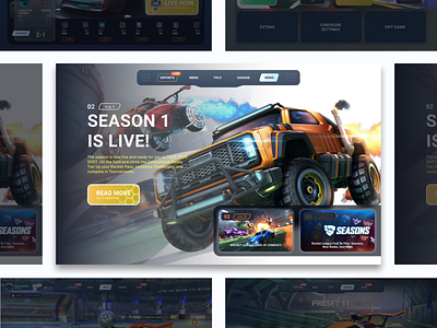
Not too long ago, Psyonix, the company behind the title (now working under epic games), made the game fully free. Together with this release, they also changed some UX/UI elements for the game. Even though it has freshened up the game (some say), I believe there are a lot of element to the design (specifically the menu/navigation) that are changed, rather to please the eye, than to imrove usability. So, what greater way to do some designing of my own, than to give this my own take, and redesigning some of the rocketleague main menu screens.
Imagine a menu layout (like a lot of games these days i guess) that is navigated horizontally between the different screens, or rather subparts of the menu. This way less buttons take up space on the screen, so the player can see more of their beautiful supersonic acrobatic rocket-powered battle-car.
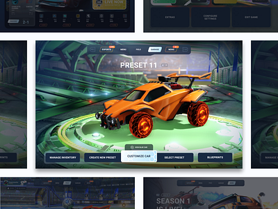
My redesign of the "garage", moves the car from the field, to a more garage-like environment. The navigation is informationwise the same, with the exception of the "select preset" button. This button would in turn direct you to a screen with all your cars, for easier acess. Currently you have to move through your presets of cars with L1 and R1 in a carousell fashion. So finding the right car, if you have a lot of them, can be quite difficult at times.
It's christmas season. I wish you dribbbler a very cozy and safe winter for the remaining of the year (2020). Stay safe and warm! 🎅🎁🎄