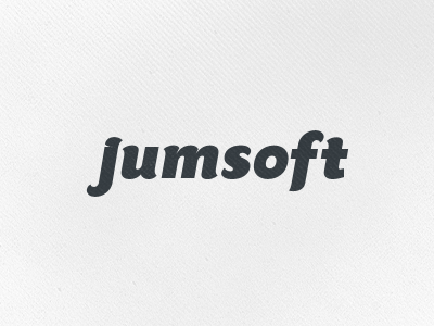
Jumsoft Version 3
Still working on a logo for Jumsoft. I can feel we are nearly done. :) Also: thanks for all the feedback so far!
They liked the curvy feel of the previous version, and they are confident it suits their company, because they do so much more than just software.
This version has tiny adjustments to the shape and flow of most letters, and added a sugestion made by the client: the dot of the 'j' as a part of the 'j' big shape.
What do you guys think? :)
More by Jord Riekwel View profile
Like
