Fabini – logo redesign
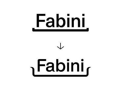


Comparison of the previous and new logotype which we had to change in order to create a working visual identity that's not just a logo.
Our intention wasn't to reinvent the wheel but rather make the previous concept of the underlying pan more visible and clear, so we can use it for in the rest of the identity and combine it with new colours and typographic style of the new main typeface.
The logomark itself is based on Helvetica Now Medium with adjusted kerning and rounded dots and edges, which are all elements seen in Jan's products.
The main typeface for the identity is Reckless by https://displaay.net/.
––––––-
Full project preview www.fabini.cz
––– 2020 Client: Fabini Designer: Michael Dolejš, Karla Gondeková Cooperation: Kiduo (Filip Šimoník, Zuzana Vyhnánková Brečanová), WeAre (Jakub Dohnálek, Michael Šroubek) Font: Reckless , Helvetica Now Display Type: Brand, Web
––––
Collaboration with Karla Gondeková www.karlagondekova.com
and others: www.kiduo.cz www.weare.cz
–––