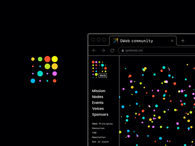
DWeb favicon
It turned out that logo as a favicon doesn’t work here.
Next, it got clear that although a simple colored circle or a square seem to be a minimal and obvious alternative, they look boring and say nothing…
Not a problem at all :)
More by Ira Nezhynska View profile
Like
