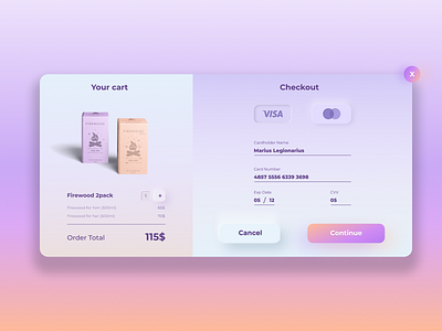
#2 - Credit Card Checkout
Designed a simple checkout card, with some element of skeuomorphism. Didn't want to go super extreme with the effect, as I believe repeating it too much makes the UI feel cluttered and cramped (imo always). Tried to incorporate it to some key elements, like the main action areas of the user. I also made the products shown in PS.
(anyone knows where the name is from ;) )
Drop me a ❤️ and follow if you are kind enough.
More by Shexxy View profile
Like
