Interaction flow and screen hierarchy concept

An idea of how to better communicate the hierarchy of screens in an app alongside their interactions.
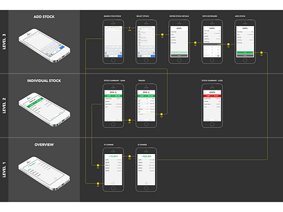
User flows In the attached, I’m using the concept portfolio app from a previous shot. The home screen which shows an overview of your portfolio is along the bottom (Level 1). From here, selecting an individual stocks launches a set of child screens (Level 2). Choosing to add another trade to that stock launches another set of child screens (Level 3).
It makes sense in terms of hierarchy to have the home screen on the bottom, but it may not be intuitive for an unfamiliar reader to start from the bottom. This version is also very unfriendly to print being completely dark.
Larger version attached.