Onboarding
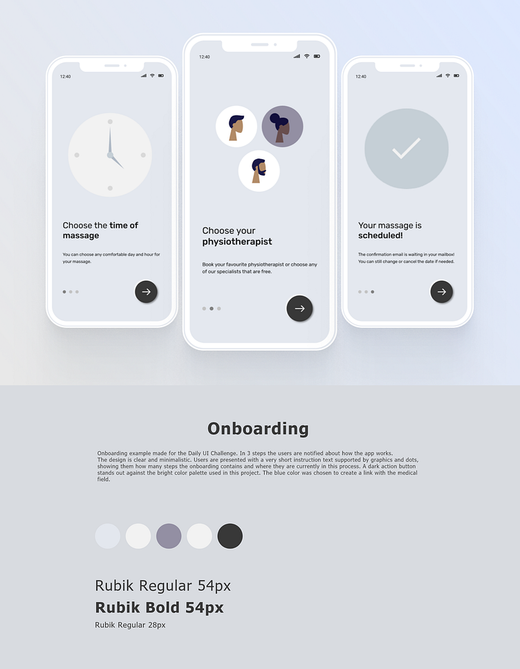
Onboarding example made for the Daily UI Challenge. In 3 steps the users are notified about how the app works. The design is clear and minimalistic. Users are presented with a very short instruction text supported by graphics and dots, showing them how many steps the onboarding contains and where they are currently in this process. A dark action button stands out against the bright color palette used in this project. The blue color was chosen to create a link with the medical field.
Color palette: #E3E7EE #F2F2F2 #938FA3 #F2F2F2 #383838
Typography: Rubik Regular 54px Rubik Bold 54px Rubik Regular 28px
Made with Figma
More by Monika Mosur View profile
Like
