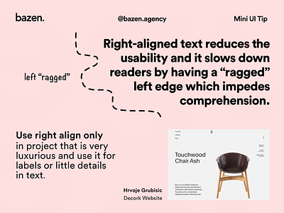
Mini UI Tip - Right alignment
Here's something you probably didn't think about, and it surely affects your perception. ⚡👇 _ Left-aligned text is easier to read than centred or right aligned text because of the way our eyes scan a page. _ It also performs best for readers because it helps the eye find the start of the next line when it leaves the end of the last one. Right-aligned or centred text changes the starting place of each line forcing readers to work harder to find where each line begins to continue reading. Interesting fact, right? 🤓 _ This is one exception, where you could and should use right alignment. Check it out!😎
More by bazen.talks View profile
Like
