Relay App Screenshots
The goal of this product is to help Traffic Engineers detect, identify, and understand traffic conditions in their network.
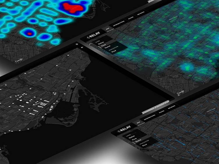
These map-based visualizations present various performance metrics as a function of their location, which helps promote the understanding of network-wide patterns which were previously impossible to detect. The use of glyphs to represent quantitative metrics provides a more intuitive understanding of these patterns.
Left: Status Indicates the working condition of an intersection.
Top: Flow (per intersection) A heat map indicating the number of cars through an intersection per unit time.
Right: Flow (along roads) An approximation of the number of cars along major arteries between intersections, based on predictive data from the controller.
Bottom: Queue Length The average wait time at an intersection.