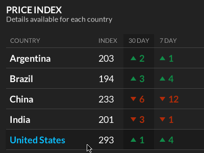
Visualization: What's normal?
One of the common problems in visualization UIs is that users need to know what's "normal" to put the data in perspective.
Expert users will have memorized normal ranges: doctors know what an elevated blood glucose level looks like. But even in these cases, a reminder is helpful to avoid mistakes.
So when I'm designing visualizations, I always try to put metrics into context. In this case, a simple 30-day and 7-day difference helps communicate that context and shows which price indices are deviating from normal.
This design was a prototype for Premise, which tracks macroeconomic and human development trends in real time. http://www.premise.com/
More by Google Ventures View profile
Like
