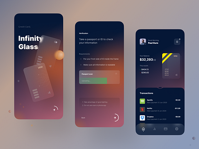
Neo Banking UI-kit
Hey everyone 👋🏽
For the past few years, I've been working with fintech projects and I can't help but note that one of the fastest-growing styles of banking applications is the so-called “neo banking” designed to breathe new life into a scary and confusing industry.
I singled out the main idea for myself: “boring things shouldn't make you bored anymore”.
The situation is twofold. On the one hand, “banking of the future” makes it possible to experiment with once absurd trends and implement them into real projects, shocking the user.
On the other hand, we must not forget that behind all this “beautiful” has a huge mental work, I am talking about the standard tasks of the application that have not gone anywhere, about working with attention, with the storytelling, etc.
While playing with the visual component, you need to remember that this is still a serious application, with a lot of information that needs to be correctly presented and conveyed to the user, at the same time, the “wrapper” of the application takes on more and more responsibility for the “wow effect” and brand associativity.
Сonclusion banal, you need a balance between UI and UX (who could doubt it), but in this case, more effort will be needed to test user interactions. Shocking the user is great, but you need to make sure that the shock will generate interest and not just scare.
If you liked my work, then don't forget to press L, and give me your feedback 🙂
My social networks ✌🏽
Behance | Instagram | Twitter | LinkedIn | UpLabs
