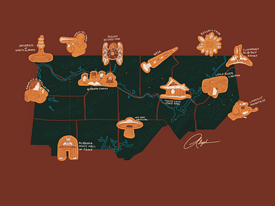
Illustrated Map of Alabama — The North
Part 01 —Illustrated Map of Alabama.
Each icon on the map was a separate illustration that I had to research, sketch, revise, and digitalize as is the map itself. In this first draft, I decided on the aesthetic details of the map such as color stories which fit the aesthetic criteria of the client (warm, rustic, natural, etc), how to present the illustrations on the map, as well as other nitpicky design details.
About the design:
I wanted to highlight the icon illustrations and the water so I intentionally chose two bright colors that contrast well with one another to even each other out across the illustration.
The green option plays up the contrasts of that design idea. The background and the map itself fade into the background and allow those illustrations to be front and center. This option doesn’t feel cluttered and instead goes for a natural feel. This was a good options for the client if they wanted a more minimal option.
The brownish/orangish option melts the colors together into a complementary color story where every chosen color feels important to the composition. This option is warm, cozy, feels like home and nature together in one. This was a good option for that hometown pride type of feeling.

