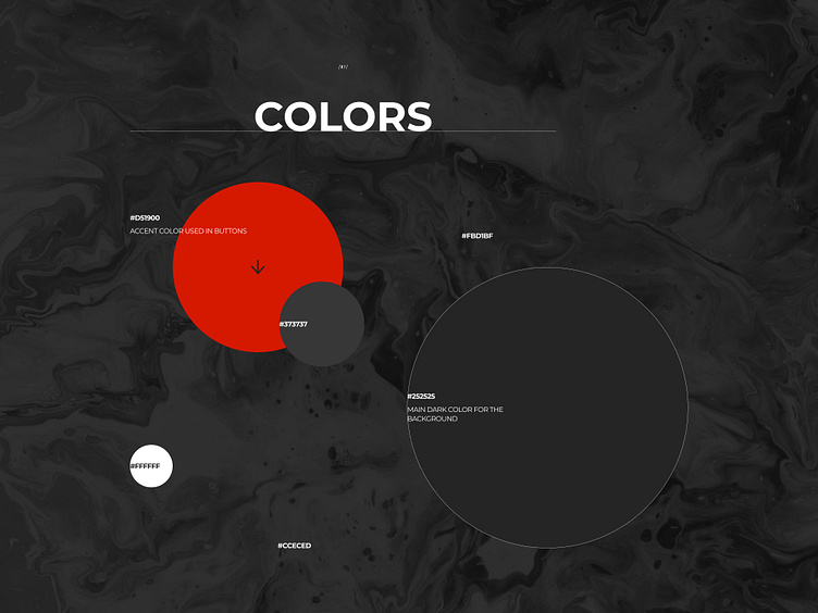
Quitebyte IT company colors
Hi there,
This is a new piece of the Behance project for the progressive IT company called QuiteByte. Full version -> https://www.behance.net/gallery/109222405/Quitebyte-IT-company-Website
In the project, I used 6 primary colors. One is accent red, the other two are shades of orange and blue, which are used to create highlights on a gray background.
Stay tuned to see more pages of this project✨
Follow my Behance https://www.behance.net/sia_lanceva Instagram https://www.instagram.com/sia_lanceva/
More by Anastasia Lanceva View profile
Like
