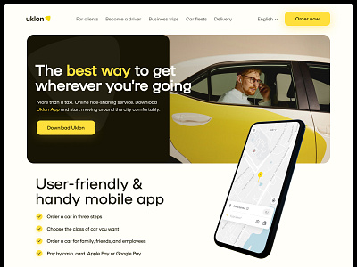
Taxi service Uklon — Landing page redesign concept
Hello everyone 👋
At the moment Uklon's landing page has a low conversion rate. I created different hypotheses for what this might be. One of them is that if we structure the information and give a more obvious understanding of who the app is for, it will help increase the conversion rate. That's why I created this concept for testing.
Here I worked on the copies and information presentation to engage new potential customers.
What do you think of this? Share your thoughts, drop a ♥️ if you like it, and stay tuned for more!
Got a cool project in mind or need help with existing?
Drop me a line at ntnkodesign@gmail.com | LinkedIn | Dribbble
More by Ilya Antonenko View profile
Like
