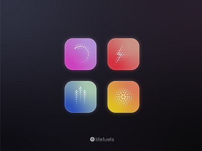
LifeFuels halftone Icons
I designed these icons for LifeFuels to denote the function classes of their flavored multi-serving supplement Pods. The classes (repair, hydrate, workout, maintain) were structured to be flexible and cover some basic action groups that encompass every existing product (Electrolytes, Multi-Vitamins, Pre Workout, Collagen, etc.) with room for additional SKUs in development. The design language of the icons was inspired by the way in which the product works: a dispense and dispersion of a concentrated entity into a larger volume. The halftone treatment is also meant to give a dynamic energy to the icons which further support the athletic tone of the product.
checkout the full label design project here:
https://www.behance.net/gallery/109000325/LifeFuels-Label-Design
and let me know what you think!
