Range Slider and Stacked Bar Chart UI
This is just a personal project where I did the design and coding.
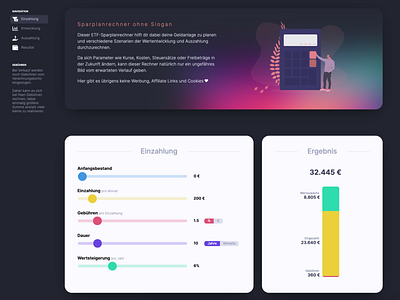
This is an ETF (Exchange Traded Fund) savings plan calculator. The approach was that it should be easy and fun to use with a casual copywriting to set the calculator apart from other financial sites and calculators.
You can try it out if you like by visiting https://planrechner.de (also with the latest design changes). I noticed that the range sliders are not precise enough on mobile so that is a thing to optimize next.
How do you like the UI for this calculator app?
