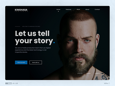
Kinshasa Features - Web Design Concept Project
I had to design the web so that the relevant information is easier to find/spot. The aim of the website is to get the user to learn more about the company or hire the company.
The dark blue colour was the best option because it represents what the brand stands for. And we wanted to keep everything clean and consistent.
View full project: Behance
More by Mike Tshimanga View profile
Like
