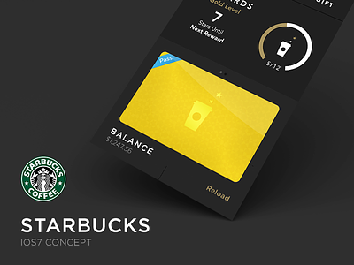
Starbucks Update
So Starbucks finally updated their app. I was amazed how good it looked for sure but was a bit frustrated with the UX. I assume most people go into Starbucks ready to see how much they have on the card and just pay. So i thought I would tweak what they had an put my own taste on it.
Hope you like the change. And also look at the attachment!
More by DONO™ View profile
Like

