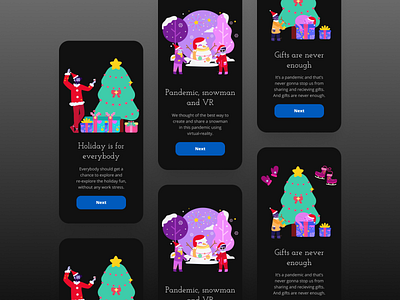
Holiday-App Onboarding Dark-theme
Hello folks,
What's the first thing that come to your mind when you think of Application, probably the Home page right, however there are other key things that make home pages better and maybe sprinkles some essence to it. One of those are Onboarding Screens. They not only walk you through but also helps you imagine what you're about to see and exerience. That's creating the essence.
So I just tried out some simple easy-to-understand Onboarding Screens. Ignore the rest that you can't see because there's only 3 main screens and onboarding should never exceed 3-4 count. That gets boring and annoying. And for illustrations I used Blush.
Hope you guys like it 👍
If you want to work with me then click that "Hire Me" button duh! 🥳 or if you're looking to connect with me I'm on Twitter 🍕
