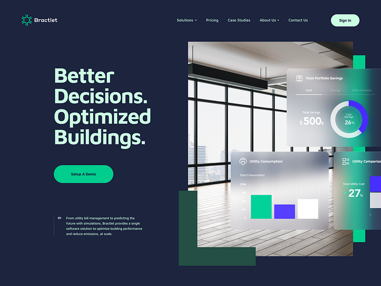
Bractlet v2 Style Exploration
Hey guys!
Let me share another exploration of style and visual language we did for Bractlet’s new website.
Bractlet is a tech company that predicts the future of buildings utility consumption and overall portfolio savings by using super sophisticated simulation and bill utility management.
We teamed up with Bractlet team around 2 years ago when we helped them bring their Benchmark, Analysis and Simulation dashboards to life. Following success of the 3 product tiers, our team was given the go-ahead to present the company and its offerings through Bractlet's new website. The goal of of the website was to show building owners how they can get more out of their buildings, which we achieved by showcasing abilities of Bractlet product tiers and creating case studies supported by science and real data.
♥ Happy to hear your thoughts.
