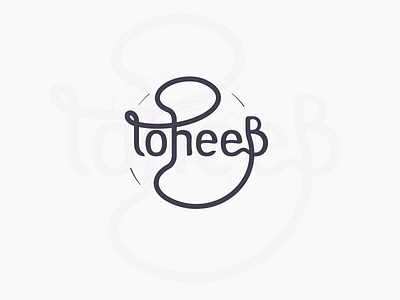
Toheeb

Started with drawing only letter "n" on paper.
Drew the shape in Affinity Designer, and used it to form the basis of the letters: o, h, and e.
Designed with vertical stress, and low contrast. At default, vertical strokes have 20px width, and horizontals have 15px. The bar of "e" has about 12px.
The flourish connects the stems of the letters t, h, and B. Bunch of ellipses are used to make a smooth transition of the curves (as shown in the guides)
Oh.. there's more to toheeB instead of Toheeb. There's more to becoming anything, hence the connected legs of the last two letters eB -> Be.
The arcs are at a radius of 300px from a chosen center, with deviation angles of 16°, 14°, and 16° respectively.
And... This is my first lettering (yay!!) even though they were mostly drawn on screen. Made that decision because about 70℅ of the letters have the same form.