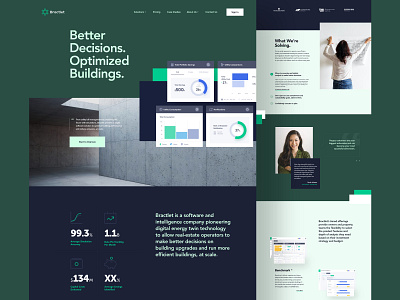
Bractlet 1 Style Exploration
Hey guys!
Sometimes exploration takes you all the way through, and instead of building bits and pieces that work well together, you end up with a complete design. It’s a natural thing, like a follow through in basketball (see what I did there, Dribbblers?). This shot is a testament to that, and it’s exactly what I ended up with when working on creative direction for Bractlet’s new website.
Bluntly put, Bractlet is a tech company that predicts the future. Yes, you read that correctly - predicts the future of buildings using super sophisticated simulation and bill utility management.
We teamed up with Bractlet team around 2 years ago when we helped them bring their Benchmark, Analysis and Simulation dashboards to life. Following success of the 3 product tiers, our team was given the go-ahead to present the company and its offerings through Bractlet's new website. The goal of of the website was to show building owners how they can get more out of their buildings, which we achieved by showcasing abilities of Bractlet product tiers and creating case studies supported by science and real data.
♥ Happy to hear your thoughts.


