Glassmorphism Exploration
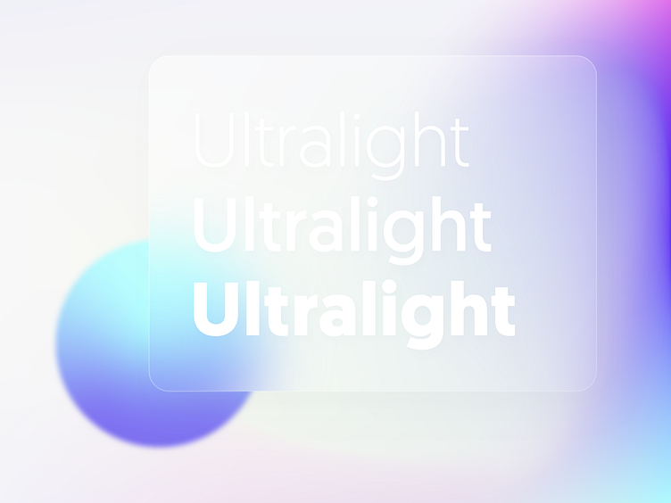
How far can we push it? I've been experimenting with low-contrast typography on glass effect cards lately to see how it affects text readability. Is it still clear enough to read?
Have a nice weekend everyone 🤘
How far can we push it? I've been experimenting with low-contrast typography on glass effect cards lately to see how it affects text readability. Is it still clear enough to read?
Have a nice weekend everyone 🤘
