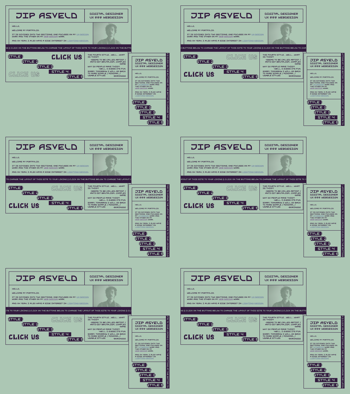
👉Design-my-new-portfolio-challenge. Day04👈
Each day this week, I am going to design and post a layout-option for my new portfolio home page. Each day, the content will stay the same, but I will design in a different digital design style/trend. Today's style can be described as 𝘄𝗲𝗶𝗿𝗱.. 𝗜𝘁 𝗶𝘀 𝗼𝗳𝘁𝗲𝗻 𝗰𝗮𝗹𝗹𝗲𝗱 𝗮𝗿𝘁𝗶𝘀𝘁/𝗮𝗻𝘁𝗶-𝗶𝘀𝘁 𝗯𝗿𝘂𝘁𝗮𝗹𝗶𝘀𝗺. 😎 (it has a similar critical approach to contemporary webdesign as the purist brutalism of day one, but much more radical).
Because my portfolio is a bit outdated (it does contain my UX design work but it does not focus on the webdesign which I am doing a lot lately) I decided I am going to make an update. The portfolio is going to be divided into a section for webdesign and a section for UX design. For this division to work, I am designing a home page that splits up the website into 2 sides/sites. Here, people can decide to which side/site they want to go.🤔
As a webdesigner, I want to do something special with my homepage. Therefore, I will give the visitors of my site the option to select between different layouts. The different layouts are the various designs I will create during these days.🤓
#webdesign #website #portfolio #portfoliodesign #portfoliowebsite #uidesign #uitrends #uistyle #brutalism #brutalistwebsites #webbrutalism #retro #monochrome
