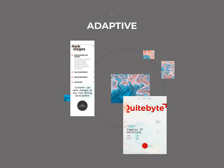
Quitebyte IT company adapive pages
Hi friends,
Glad to share with you another piece from the new project for a progressive IT company called QuiteByte.
Today, it is a adaptive versions for work stages and main pages. Responsive versions are rebuilt in accordance with the main one. There is always one or two columns of free space on the left, which shifts the overall symmetry to the right and creates a sense of dynamics
Stay tuned to see other pages😉
This project on Behance https://www.behance.net/sia_lanceva Instagram https://www.instagram.com/sia_lanceva/
More by Anastasia Lanceva View profile
Like
