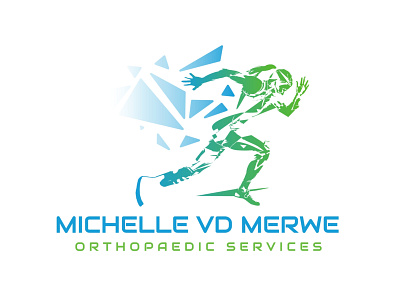
Michelle van der Merwe Orthopaedic Services Logo Redesign 2
The running lady had to stay, but the logo and its colors had to fit the industry better. The client was also just tired of the old colors in general.
So here is what I did:
As the technology & techniques we use keeps with the times, so do we and the way our brand is represented.
We have used a more modern font, added a gradient to emphasize forward motion in the logo, and combined blue and green in our logo, to symbolize confidence, integrity, trust, life, new beginnings, safety, ambition, and continuous growth & improvement, for both our brand and our clients.
More by Rolina Vorster View profile
Like
