Robinhood +
Been away for a while, figured a lil' copywork was in order.
Robinhood users get a bad rap (and maybe rightfully so), but a large part of what drives users to the app is its highly engaging interface. Compared to other "millennial" brokerage apps and the stodgy old-guards (Fidelity, T. Rowe Price, etc), Robinhood's UI is in a class by itself in terms of usability, significantly lowering the barrier to entry.
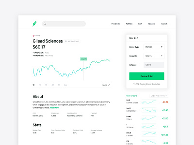
However, it's still far from perfect. And one of my biggest gripes is that there's not an easier way to view stocks in your portfolio when you're looking at a specific stock's page other than clicking on the "Portfolio" navigation link. There's an interaction cost to moving between these two primary screens that I believe should be more fluid.
This new design gives users easier access to view all the stocks in their portfolio even if they're on an individual stock's page, as well as a quick link back to their portfolio in a place that logically makes sense ("Your Stocks" link).
Any other Robinhoodies out there? Tell me what you think!
