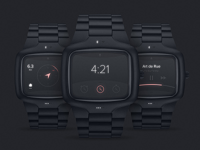
Nixon smart watch concept
Check out the high res version
Here is my vision of what a smart watch should be. A bespoke interface that fits with the brand and the watch design. What makes a good watch is not only its functionalities but the design as a whole : object + interface.
This watch is The Player model by Nixon.
About the interface itself, only 3 functionalities : Time, navigation and Music.
The watch synchs with your phone and you can control your music with basic controls : next, previous, pause. The navigation doesn't show a map, just the direction to follow and the distance from your navigation.
The top panel with the Nixon logo slides down and shows the connectivity options. The bottom panel shows options within a screen. Slides up and down as well.
The glowing dots at the bottom of the screen show the battery level. Inspired by the Fitbit design.
Hope you like it ! More coming soon :)
