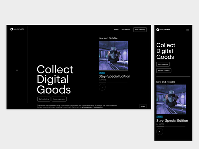
Blockparty landing page hero section


Hey there, glad you were able to see this hidden design draft!
I noticed you were looking for a UI/UX rockstar to help you take Blockparty to another level. My exact speciality.
I have been working with tech startups for the past 3 years professionally and even made one win the best startup among 50 others at a startup convention in Charllote, NC - and secure 100 initial loyal customers.
I really like what you are doing, and had no IDEA about real-world assets. (they exceed $256 trillion globally?!) I had a look at the market and see there is not much competition for Blockparty aside from https://www.rareart.io/ ?
A BIG chance to establish a strong brand presence, so I agree this is the best time to invest in a killer online presence. Great decision and opportunity to get this right.
I wanted to just give a couple of pointers regarding the homepage:
1.) It does not explain anything to the visitor who just landed on the site. They have to be able to grasp what Blockparty is about without scrolling. Otherwise it creates confusion for them. Users do not want to put in effort more than necessary just to know this. This can cause high bounce rates.
So that is why I would still include the featured art section, but put the primary attention on the "Collect Digital Goods" CTA.
2.) It feels like the whole page is about Yatte and not Blockparty - the go to place for collecting digital goods. Like the site is dedicated to a single art piece. I do not think that is your aim, is it? (I am aware though that you might not have a lot of material as of yet.)
Please feel free to take a look at my portfolio here on Dribbble. I would love to talk with you about how to improve the Blockparty user experience and brand pressence.
Best,
Ivan
