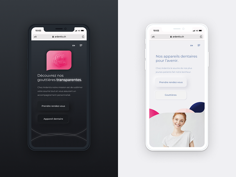
Ardentis orthodontics website
This design was created for Ardentis' new stand-alone website promoting their state of the art orthodontics solutions.
The challenge was to design two different landing pages - one dedicated to children and one to adults -that would cater to different people yet still remain part of the same visual ecosystem.
The final product is a three-part website that is browsed through a swipe motion allowing you to go from slide to slide to discover the content in an easy and facilitated yet entertaining way.
More by Marvelous View profile
Like
