Tapao Cat Logo
BRIEF
The client wanted a memorable mascot for his takeaway web app, tapao.co. Tapao (or da bao) 打包, means "take-away" in Singaporean Mandarin.
Most regional food delivery apps have an animal as part of their logo design. Think Deliveroo (Kangaroo), FoodPanda (Panda).
DISTILLING FEELINGS
Since Tapao was a takeaway app, we wanted a creature that was sprightly. As though it would slink up to the food counter to pick up a bag of delicious food without interrupting the dine-in F&B operations.
In my mind, the proposition of the app Tapao.co was that anyone could pick up their food, and retreat into the comforts of their home while enjoying their meal. Preferably lying supine on the sofa :)
LANGUAGE CONSIDERATIONS
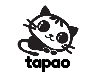
The client wanted something that was cute, kawaii. I played around with homonyms (things that sound the same), since homonyms is big in mandarin language. I settled on a cat. Mao 猫 would rhyme with Tapao 打包, so this little fellow is called Tapao mao 打包猫 .
Pao (or bao) 包 has double meanings of "bag", and "bun". I wanted the cat's head to look like a steamed bun (think xiao long bao). I included three stripes on the cat's head to resemble the folds of a bun.
PROCESS
I downloaded a few photos of cats. While I loved the sculptural feel of a sphinx cat, the client felt like the cat needed to feel content. Satisfied. Satiated. Purr.
I looked at a few more references of how cats were illustrated, and started free-style sketching in illustrator.
Being a dog owner my whole life, the proportions were not easy to get right. I was aware that the head needed to be larger than the body since that's the easiest way to make it kawaii. But I must admit, the limbs, tail, and paws were the toughest to decide on.
It took me a few iterations and feedback sessions. The client was finally happy with this. I'm now working on making this an SVG animation.
