Day 13 #30daysofwebdesign

Redesign for the Singaporean food review web called Eatbook, they are basically doing restaurant review, publish the latest food news, etc.
I did a quick redesigned their logo, combine their name with the picture of Durian.
I realize their dominant color is pink in their current web, so I decide to adopt pink for my redesign
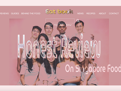
Since it's about food review mainly, so I put people as first priority. They have a lovely pic on their web with all the staff and pink background, I think it's good to use it as the image for my design.
I simplified their search bar and filter, to make it looks short and sweet. And put it in the middle to draw user's attention, so they won't missout the search bar. (In their current design, they also put it in the middle, I guess the search bar probably is what they want to emphasize the most)
I combined the "Honest review" letter with their faces image as well, to express the genuine comment they leaves and the main purpose of this web.