Healthcare Data Visualization
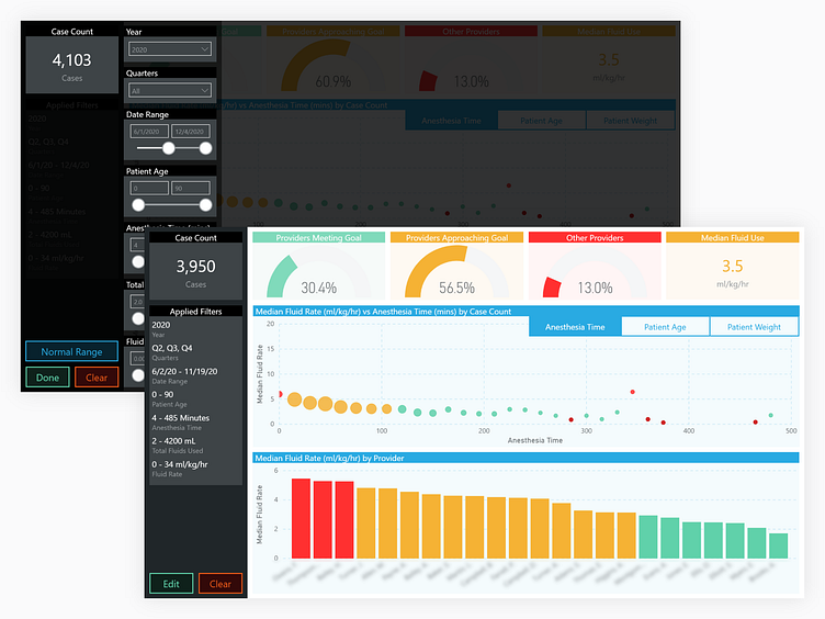
This report was designed as one of many in a suite of interactive healthcare reports. Although some rudimentary concepts were created with traditional design tools, most of the design was done inside the visualization tool—Microsoft Power BI. Although it's design capabilities are limited, the tool has enough flexibility to build some compelling features, such as tabbed menus, overlays (used for revealing filter options), setting default filters via 'preset' buttons, and other state-based components.
