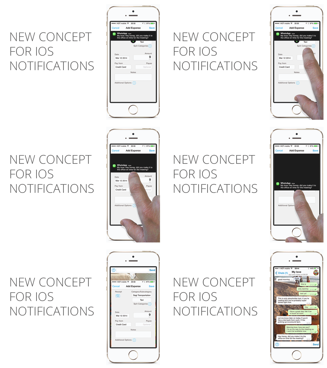
Taking iOS banner notifications out of the stone age
So... Banner notifications...
In our mobile, fast paced, ADD, schizophrenic world these notifications are blessed. They allow us to be alerted while having the choice to: A) Wait it out, B) Slide it up to continue with what we’re doing, or C) Click and launch the app.
But.. banner notifications are a bi^$#, here's why:
1. They are very hard to slide up. Sometimes it makes you believe that this action requires special super hero skills to get it right without accidentally clicking on it and launching the chat app.
2. Actionable controls are located on the top bar in most applications ( as recommended for iOS design patterns). This is a major UX flaw.
In a world where we are flooded with chat services, emails and other interactions on our mobile phones (FB messenger, Whatsapp, iMessage, emails, Twitter, Linkedin and more) it makes it impossible to use the top bar without interruptions.
My solution
1. Notification below the top bar. I moved the notifications where they are most likely will interfere less. I also took under consideration the top notifications panel and the bottom quick actions panel so the banner action will not accidentally interfere with those.
2. Bigger touch space for our fingers. Designed a bigger touch element to slide up or down.
3. Slide it up or down. No clicking.
4. Giving it some soul (only for UI sake) I gave some transparency and shadow to the banner (see attachments).
I've written a full post about this called Why iOS notifications are ruining my marriage (and a UX solution) on Hacking UI.
Let me know what you think!


