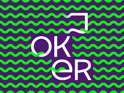
Lettering 01
Dusting off an old lettering sketch I did for a corporate identity rebranding.
I found this in an old folder while searching for some other ancient thing. I rebalanced the shapes and proportions and played around with the connections between the letters and waves.
Originally the colours were dark blue and red, but for it's first "public outing" it seemed appropriate to change things up a bit.
The idea never got used. In the end, the client went with another option.
More by Marko Borota View profile
Like
