Procreate Icon Reimagined
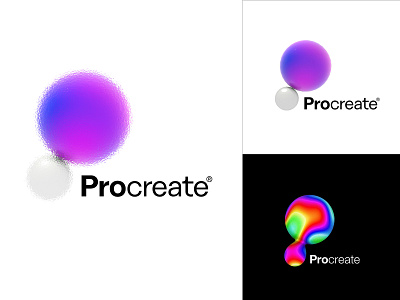
Tactility and transference were the principal thoughts behind this design. The synergy between the two spheres forming the letter P denotes the essence of "Procreation" as well as that of "Paper". The app endlessly manifests the visceral experience a paper provides for an artist and hence the reason for a 3d appeal in the logo. The colors form the life of this experience and the UI design of the app's color tab was another inspiration to go with these spheres.
Co-creator: Aninya G
Thanks for the interesting and fun opportunity!
#GetCreativeWithProcreate