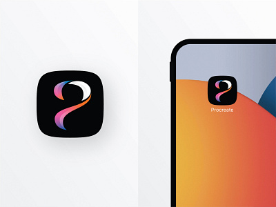
Procreate Icon Redesign
Had some extra time to noodle on this over the weekend and liked how it turned out. Kept a lot of what makes their iconic swoosh recognizable and pulled a letterform out of it. I love how it also resembles a ? which begs the question---what will you make today?
More by Mike Yevin View profile
Like

