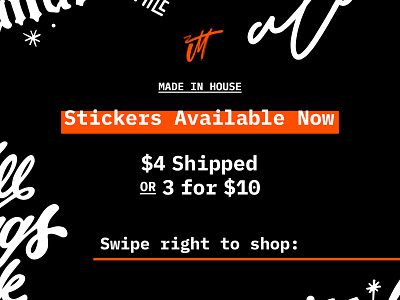
Sticker Time + Personal Rebranding
Spent the last few months quiet while I worked my day job and thought deeply about what I wanted to do with my side project of lettering & freelance projects, and how I wanted to share that with the world.
During all that, I began playing with layered paints and this little JM swoosh (very similar to a high school logo I used to use for myself). This fit with my brush lettering multi-colored pieces I was working on, but I didn't know how that would tie back to my brand.
Then I landed on something. I built my homepage in a dark mode to try looking at things differently and freshen it up. I loved the new look, and swapped from my army green/olive color to this orange to pop, and ran with it! After drowning in an endless see of sans serif typefaces, I found this semi source-code look, which felt like a fresh way to compliment my loose lettering style. Feels fresh and way more me.
Very excited with the look, the incorporation of lettering & design, and now the launch of my sticker shop! Check out the links below and let me know what you think! Very much a work in progress, but live and semi-ready for the world to see! If you would like to support me and get a cool sticker in return, I would be honored!
