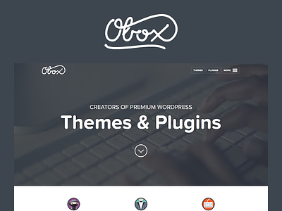
Obox Themes 3.0
Really proud to announce that our site redesign of Obox Themes is live.
Some pages that I am really proud of include:
Business landing page
We rented out a drone and flew over our beautiful city during sunrise in order to capture an awesome background video that would depict a 'business' type environment.
Social Commerce
Just love the colors that we used on this page, the icons were also custom designed to suit the theme.
Themes page
WordPress is generally a bit of a boring industry so it's not the easiest thing to make WordPress theme pages look good. That being said, I really feel like this goes a long way to making them a bit more exciting.
I decided to animate the screenshot spread on :hover and use a combo of alternating layouts and colors. What I am most proud of though is the copy writing - especially compared to our old site which left much to be desired!
Fun facts
- We had to take over 1100 screenshots for the new site
- All icons were custom designed, 97 made the cut and over 200 we discarded
- Work on the new site started 12 months ago!
Lastly, we made a little video explaining our thinking behind the site which you can view here.
Any and all feedback is always appreciated!
