ProCreate Logo
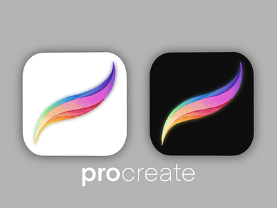
When I saw the announcement of this rebound contest on twitter I was immediately excited by the possibility of it. Then I immediately got a panicked feeling of what in gods name could I do to such an iconic logo. As I continued to think about procreate and how would I change the logo I had an epiphany; it doesn’t have to be overhauled (procreate has a beautiful logo) but if I were to make my own version what would I do. Procreate is an app for artists, it is built to bring the world of the physical to the digital world and there is nothing that compares to this app or its abilities, so if I were going to have a say in a redesign of any kind I would want to express that element of the physical world. I would want to create a physical art technique. It is the kind of redesign that could be done all the time with different art techniques, watercolor, fresco, gauche, pen and ink without losing the iconic nature of the original logo. At the same time it would add texture or some elements of art on paper or canvas which this app is meant to evoke in my humble opinion.
so in the end I chose to do a Stippling technique because even though it takes a long time it is one of my own personal favorites. The design was twofold the stippling evokes the technique of ink on paper but also harkens back to the early days of digital art and microsoft paint which I rememeber using all to well in my own childhood, (back when I still had a physical sketch book with me everywhere I went; now I just use procreate on my iphone to sketch on the go)
I also wanted to show the icon in both its phone form as well as its ipad version.
In the end I hope you all enjoy, I had fun making this!
#getcreativewithprocreate