Lupa | Branding and UI Concept
Lupa | Running Coach App
https://www.wearelupa.com
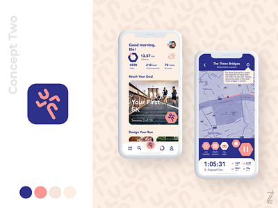
Most running apps just track data you might not even understand, they assume you’re a skilled runner, and they do little to understand you or give you an actual experience. Lupa aims to understand what your needs are, what your goals are, guide you through your run and really create an experience of running rather than a chore.
Lupa is Italian for a she-wolf, and their logo was of a wolf, which I knew their founders Eleonora Mantovani and Stefano J. Lorini were extremely fond of. However, I had a lightbulb moment that got me creating a running man constructed of lines that represented the letters of LUPA, something that I was really fond of. And so I used the idea to mockup various colour palettes and UI concepts for them based on different goals for their app. See which one you prefer! Also see some social media post templates I created for them.
See the full project at: https://dribbble.com/zlcreative/projects/4076095-Lupa-Running-app
-----
Like what you see? Get in touch with me: zlcreativedesigns@gmail.com
