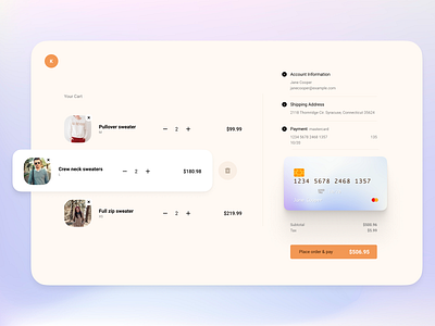
Check Out Page
A check out page concept with minimal approach. What do you think about the colour scheme and the placement of the credit card? Too much? The idea is to have form above the (visual) credit card, so the info update as the user input data.
Press L if you like it and feedback is welcome. Follow me so you can get updated and we can talk about design or, become friends :)
More by kailoon View profile
Like
