Procreate Redesign
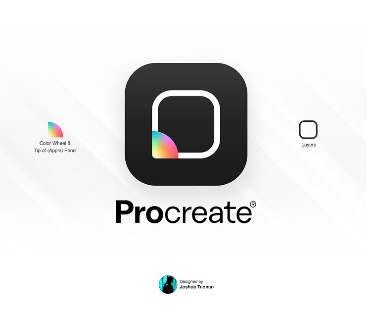
I love to watch how Procreate works, but I never got the chance to try it. The current icon is already ICONIC and it's quite a journey redesigning this one. I’ve come up with several designs and finally produced a simple and meaningful one. Overall, the icon can be seen as a pencil, mainly because Procreate is designed perfectly for iPad and apple pencil, I have decided to make the tip of the pencil look like the color wheel. The square icon also resembles the layers.
Not expecting to win in this playoff, I already won to myself; making myself creative. It was fun.
#GetCreativeWithProcreate
More by Joshua Tuonan View profile
Like

