Procreate Icon Redesign
Through this redesign I wanted to capture the idea of Procreate as a tool that enables people to develop their ideas into fully formed works of art (that might even surpass their initial imagination!).
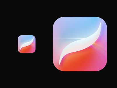
To achieve this effect I turned the Procreate logo into a refractive prism.
The beam of light that enters from the left represents that initial idea someone has as they go to open the app. The rainbow that flows from the opposite side demonstrates that with Procreate, the prism in the middle, one can effortlessly translate that initial idea into artwork that's ready to present.
Thank you for reading, let me know what you think!