Typo Calendars
Typo Calendars:
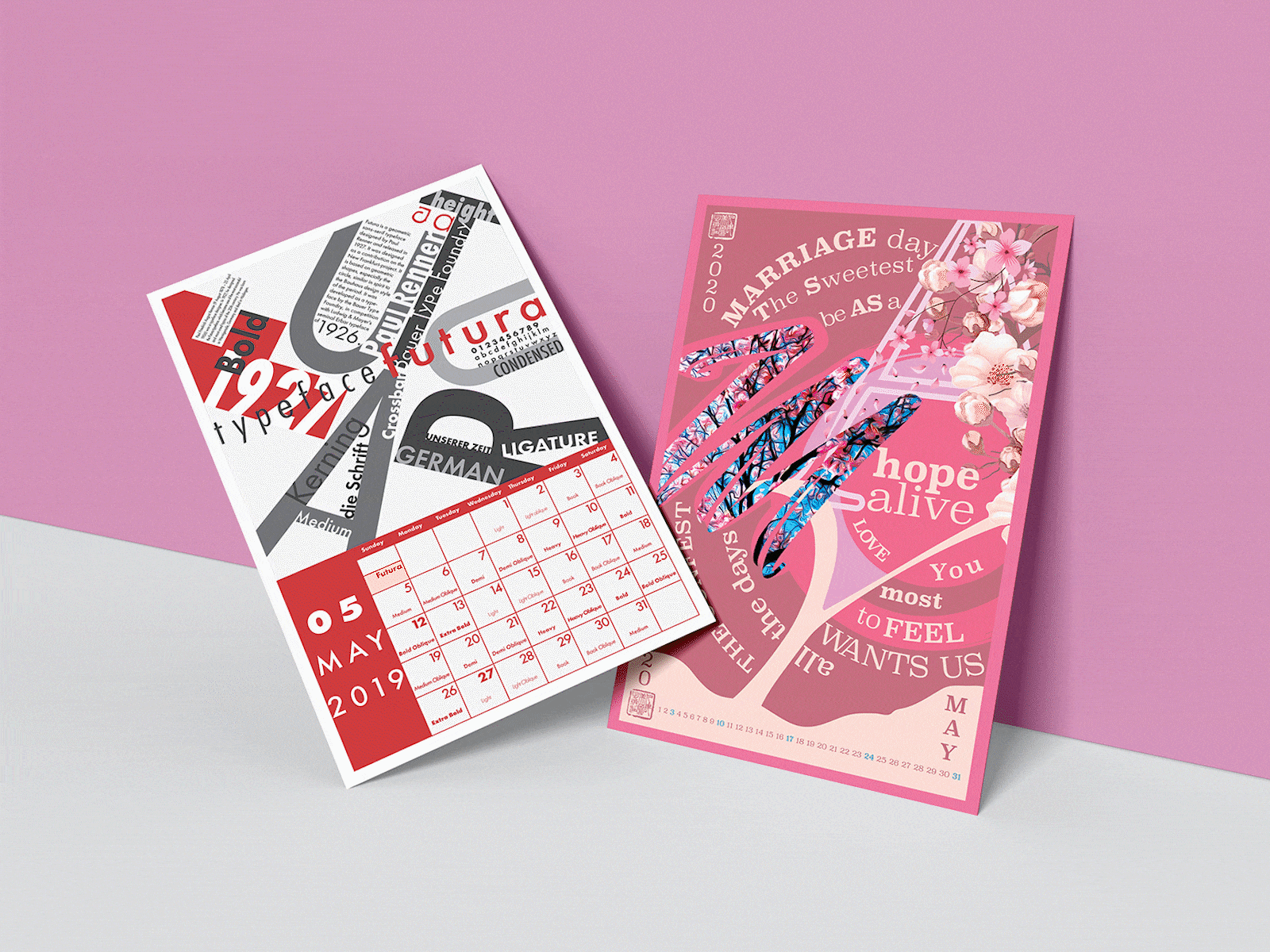
1. FUTURA CALENDAR – Poster Futura is a geometric sans-serif typeface designed by Paul Renner and released in 1927. It was designed as a contribution on the New Frankfurt-project. It is based on geometric shapes, especially the circle, similar in spirit similar to the Bauhaus design style of the period. It was developed as a typeface by the Bauer Type Foundry, in competition with Ludwig & Mayer’s seminal Erbar typeface of 1926.
2. MAY 2020 CALENDAR – Poster The ultimate purpose of the following design piece would be to mainly empower viewers by sharing a different perspective about life, and its relationship with the beauty of nature.
3. GEO CALENDAR – Poster The Geo Calendar it’s designed to showcase the 365 days of a Gregorian year. The ultimate tone and manner of the following execution it’s recollected through the adopted ellipsoid shape. It reminds of the cycle of a leap year, which is the result of the number of days of the Earth’s orbital period. Each month it’s illustrated by appealing to a cycling pattern, where each number represents a day of that specific month, while in bold the related Sundays. ➡️ Full Project ⬅️
Thank You For Viewing! Feel free to shoot me a "Hey Gio'!" at: giovanniferrettimedia@gmail.com. You can find more of my work at gfcreative.ca.