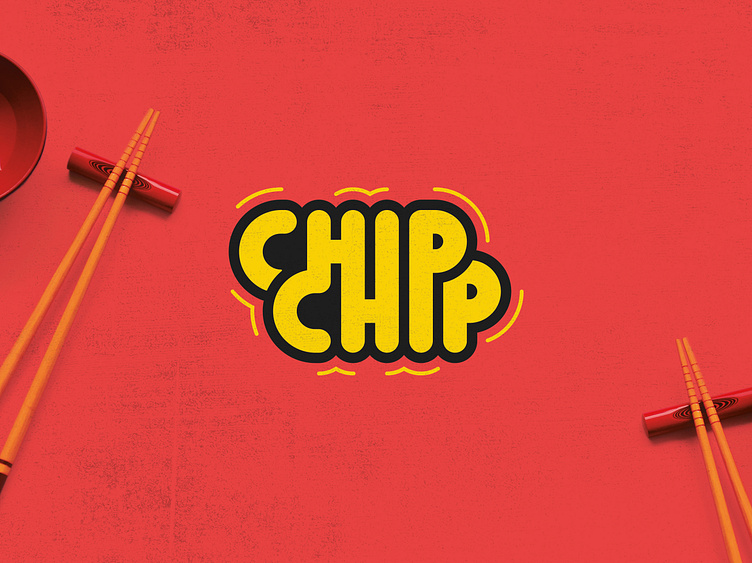
Chip Chip
I’m delighted to have won Logo Battle #162 on Reddit’s /r/logodesign/ channel.
Every two weeks the Reddit community at /r/logodesign/ runs a Logo Battle, in which entrants are given a brief for a fake client. This month the brief was for a company called Chipchip; a manufacturer of Japanese style seaweed and tempura snacks made and marketed for the North American market. Here was the brief:
“They are looking for a fun logo with a bit of a kawaii vibe but not too far on the cutsey end of the spectrum. Bright fun colors (not necessarily a ton of colors, but more importantly a winning color combination) is something they're really looking for and they want the type you use or create to feel playful and not totally sharp and perfect. So maybe something hand drawn or with some interesting character to it.”
This was a tough one. I initially toyed with an ambigram idea, styling the characters like kanji. But no matter what I did I couldn't get it to work clearly. I also did an ambigram, and while I got it working, it just didn't look stylish enough for me.
Proud of how this version came out though. Hopefully it's playful enough (bubble style strokes and rounded corners) to match the brief.
What do you think?
