Procreate Redesign Challenge
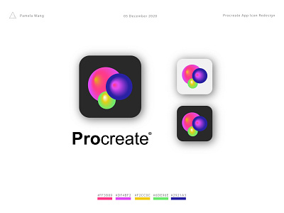
This is my Procreate app icon redesign for the Procreate Playoff!
I used Procreate's original colours because I love how bright and artful they are against both light and dark backgrounds.
The bubble-like icon is inspired by the colour picker tool as colour is one of my favourite aspects of design! Furthermore, according to the Bouba/Kiki effect, the rounded shapes of the bubbles will make it more inviting for the users to click on.
I had a fun time creating this redesign and would love feedback, comment down below with your thoughts!