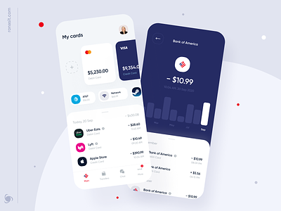
Bank of America | Online Banking Mobile App Concept
💌 Have a project idea? We are available for new projects info@ronasit.com | Telegram | WhatsApp | Facebook | Linkedin | Website
Do you remember our revamp for the Bank of America's mobile app? Today we are sharing more screens with you!
Here's a profile screen with account details, a card page screen with the card balance and history, and a transaction screen where a user can transfer money to other people or pay for services.
We decided to keep the UI palette in the standard colors of Bank of America. We also added the bank's well-known logo as the icon of the main screen.
We added a widget on the card page showing the spending stats for the last 4 months. It is a small tool that helps users to manage their spending.
How do you like the screens that we shared?


