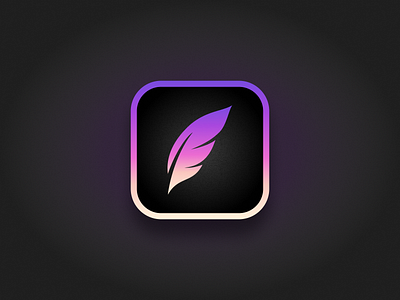
Procreate App Icon Redesign
My take on the Procreate design challenge. Saw everyone working with the current swoosh and decided to do something different, a feather.
What do you guys think?
More by Dennis Pasyuk View profile
Services by Dennis Pasyuk
Like


