Halcyon Health - Brand Identity
Formerly known as Urban Nutrition Consultants, Halcyon Health is a business dedicated to improving people’s quality of life through evidenced based nutrition counseling and medical nutrition therapy.
The word Halcyon means a time of peace and tranquility, two things they look to bring to their clients as they develop a better relationship with food. We wanted the brand to express diversity, so I developed a colorful palette and playful logos for the main brand and its sub-brands.
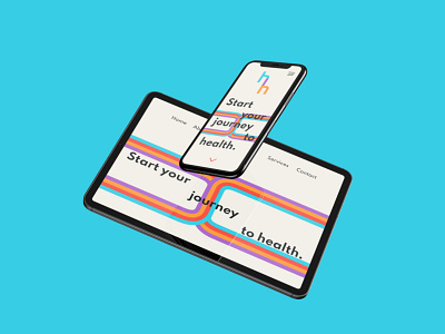
The train tracks represent their clients' journey to health and are inspired by the iconic NYC Subway map as it is a very significant part of the city Halcyon and myself are proudly based in.
See more: https://www.behance.net/gallery/107960639/Halcyon-Health-Branding
